The Story
Sometime in the past, I was approached by academics in the Faculty of Arts to discuss the numeracy skills of the students in their faculty. They wanted to discuss how they might include numeracy skills in some of their courses across all the degrees they teach. It was a lot bigger than the MLC could reasonably do, but I said I would certainly be able to do a small thing in a few courses, and certainly help their students in the MLC itself when they came to talk.
Then in January 2019, almost out of the blue, I was sitting down at a meeting with the Faculty of Arts Associate Dean Learning & Teaching, and the course coordinator for their core first year course called “The Enquiring Mind”. We were talking about how I might run a workshop for their students to introduce the importance to numerical skills for Arts students. We agreed on Week 4 of semester, and then I walked away into the Summer School exam period and O’Week and the crazy beginning-of-semester rush, with ideas percolating in the back of my mind for what I could possibly do in an hour.
As the weeks went on, ideas began to crystalise, but only really came together during the week before, and specifically in the weekEND before. After a late night Sunday night with a few hours put in by my wonderful wife with the printing and laminating, we were ready, and we launched into the tutorials the next day.
It’s been an interesting week. Across the week, we did 19 tutorials, with me (David) doing 14 of them, Nicholas doing four and Ben doing one. (Meanwhile at home I had parent-teacher interviews for both daughters, and one of our pet chickens died, and we were preparing for our older daughter’s 15th birthday.) We had some very rude pushback from some of the regular tutors and the students, and some mild eye-rolling from several students in every tute. But some of the other tutors raved about what we did, and I could see students taking photos of the slides and learning terminology, and they all certainly know they can talk to the MLC. Overall I think it went okay, but it still might not be quite the thing the students needed.
The Activities
Anyway, let me tell you what we did. I didn’t want to swoop in and tell these students that they needed maths skills and beat them with some activities that would teach them those skills, especially when several of them probably didn’t need us to teach them those skills and others would just have paralysing fear. I very much wanted them to hear a message of confidence, so I decided to tell them that the very thing they need to make sense of number is the same skills they use for their Arts courses. I used a couple of things from the #MTBoS and designed a couple of my own things to tell a story around this message.
1. How many?
To start with I asked them to count things in this image I got from Dan Finkel’s Unit Chats page, which was inspired by Christopher Danielson’s original work on unit chats. The image itself is originally from Adam Hillman’s instagram.
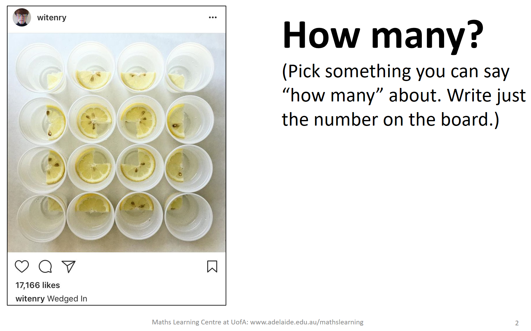
I asked the students to pick something they can say “how many” about and to write just the number on the board. When I first started, I just asked them “How many?” but students universally thought it was a puzzle and all figured out the number of lemon slices, as opposed to getting a number of different responses. So I changed it to highlight that they could count many things.
After getting several different responses, I asked students who had written them to tell me what the number was counting, sometimes asking how they counted them. My favourite response of the week was “12 lemon-diameters around the edge of the big square”. But I did love just as much the variety of things that were counted, such as seeds, artists, the letter e, likes, empty spaces and cups.
The point of the activity was that numbers are meaningless without knowing what they are counting or measuring. This might seem like it’s a really basic message, but it really isn’t. These students will need to be interpreting information presented in articles and government reports and there are many a number in there that simply won’t make any sense without knowing how it is measured. For example, if a report mentions “reading ability” with a score, you have no idea what that means unless you know how it was measured.
I didn’t give this specific “real world” example until a couple of days in, when we got an irate email from a student saying the activities weren’t applicable to his degree. So I went into the reading list for the course’s assignment and specifically chose something that was mentioned there. I also started explicitly mentioning how the tutorial will continue in the same fashion, with activities that are a little frivolous, but will help us to think about concepts we can later apply to things more serious. This seemed to get students on board a little more than the very first tutes.
2. Big, small, middle
The second activity was one I designed myself, and its point was to highlight that while knowing what a number measures, it is still not enough information to interpret what the number means. I tried it out on Twitter a few days beforehand to see how it might work, and people seemed to like it, so I decided to include it.
I put the number “100 people” up on the slide, and asked the students to discuss among themselves in what situations they might hear this number and think it was a big number, what situations it would be a small number, and what situations it would be a number in the middle. After they had discussed for a bit, I took suggestions from each group and wrote them on the board. There were some good suggestions and some pretty silly ones like “100 people is big for people in an elevator”. It wasn’t until the second tutorial that I started getting deeper into that and saying, “Do you think it’s possible for that many people to be in an elevator?” (The consensus is that it might be possible if you lie them down and stack them.) Anyway, answers like this allowed me to make the point that it might be better to give answers that are possible, but still big or small.
Now that they knew how the game worked, I gave them a couple more to discus (2 kg and 5 hours) for a few minutes, and afterwards I took answers from the groups that they thought were the “best” by whatever method of choosing best they liked. Several tutes mentioned that 2kg would be a lot of drugs to find, and several also said 2kg would be big/small/usual for a newborn baby. This particular one we googled a couple of times to see where it did actually lie.
The overall point was that even if you know what a number is measuring, it’s only meaningful by comparison. For the purposes of their Arts courses, this means that if they want to interpret a number in an article or report, they might need to do some research to find out what the other possibilities are for what it could be, in order to know whether it is big, small or in the middle. (The newborn baby helped with this point!)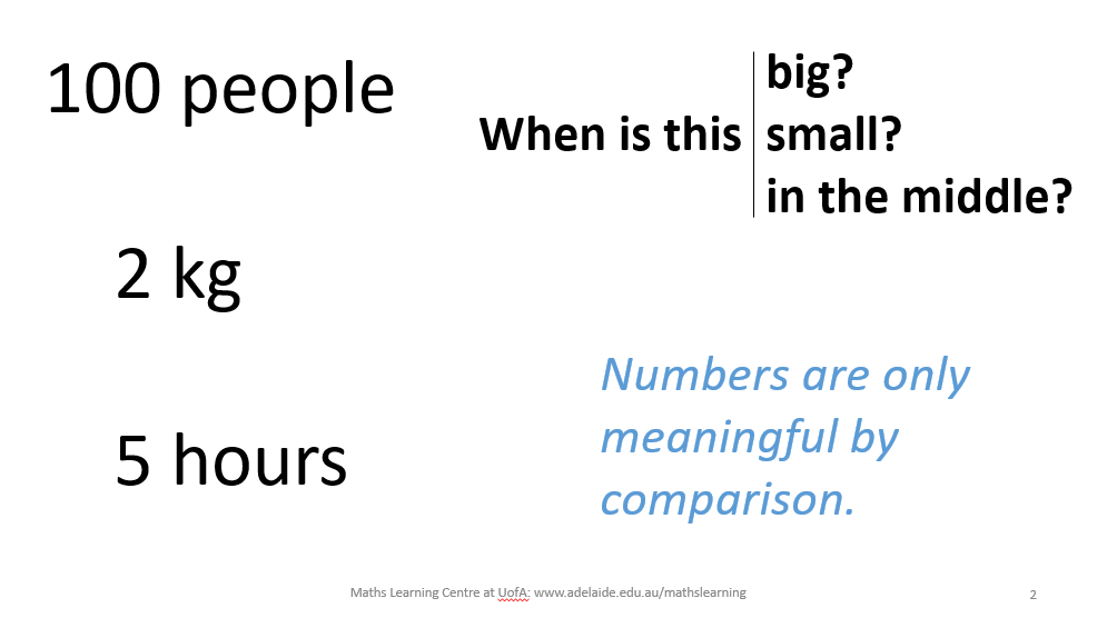
This was the point where a few people in the tutorials really looked like they were listening, probably because I had made a point specifically about their process for attacking assignments in their degree!
Before I moved onto the next resource, I showed them the website Is That a Big Number?, which allows you to put in a number with units and it will tell you how big it is relative to big things (for example it will tell you that 500kg is just a bit lighter than a thoroughbred race horse).
3. The Squeetles
The people who ran the course wanted something to get students thinking about numerical summaries like means and percentages, and I had had a lot of success in other courses with doing that using data cards, so I set about creating a set of data cards I could use to do this with. I do have a set of cards I use in the sciences and health sciences about transport use and weight and height, but knowing the kind of students I was working with, I was afraid of the philosophical details getting too much in the way of the mathematical point, so I wanted to create something that was a bit more frivolous. It wasn’t until quite close to the classes that I hit upon the idea of making little animals, which came to be called squeetles after a discussion with my wife and kids.
I also needed to make something that allowed me to form groups of students easily, without it being really fiddly or the point being messed up because we didn’t use all the data from a specific group. This meant the numbers and categories had to be carefully spread across the cards. All of these constraints were tough, but in many ways a fun little puzzle to solve, though a bit stressful doing the final design, print and laminate on the night before the first tutorial!
Anyway, I got them made in time. Each squeetle has either spots or stripes, and is shown jumping to a specific height. You can download the squeetles data cards here, if you want them. They are designed to hand out to a large class and form groups of size about 12 using the numbers in each corner. It doesn’t matter if the groups aren’t exactly 12 each — they’ll work with a bit of wiggle between groups. Also it doesn’t matter if you only have two or three groups, using only 24ish or 36ish of the cards, though it’s nicer with at least three groups.
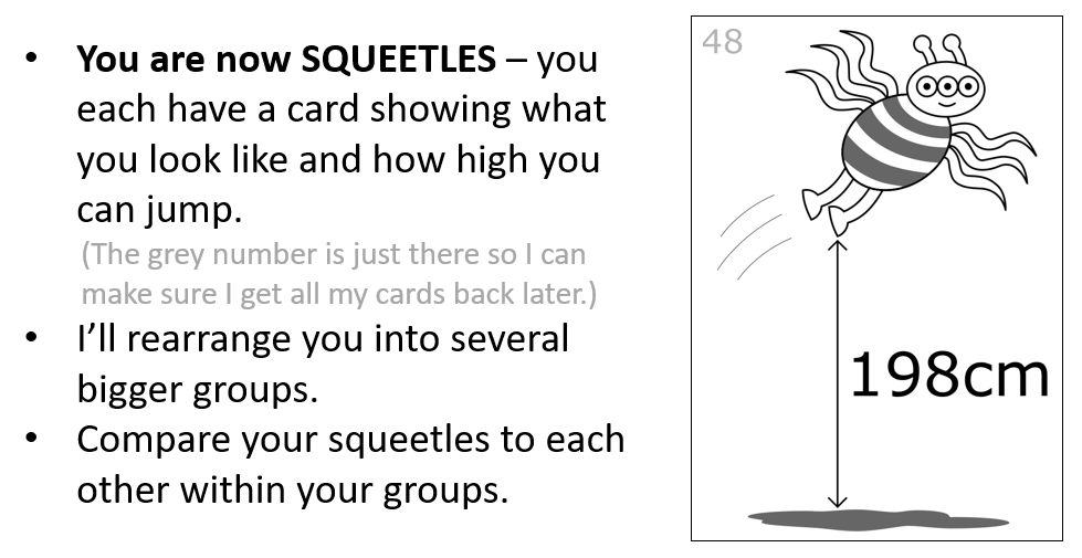
I got them to do several activities with the squeetles cards, to get at the idea of trying to represent a group using numbers like averages and percentages.
3.1 Choosing a representative number
First, I asked them within their big group to choose one squeetle from among the group who they think best represents the whole group’s jumping height. This was very interesting. A couple of groups across the week decided that they should choose the highest-jumping squeetle, thinking that in a jumping competition they would win. A couple of groups across the week decided that they should choose the lowest-jumping squeetle, because that would mean if a decision was made based on squeetle jumping ability, then all squeetles would be included. These did highlight that the word “representative” is not actually meaningful without knowing the context, which played into our overall theme. Unfortunately most of the groups that chose these were more or less deliberately trying to come up with things that threw a spanner in the works, and were a bit miffed when I asked them to consider how they might choose a representative if you didn’t know whether jumping high was good or bad.
Anyway, the majority of groups chose a representative that was in the middle in some way. Most groups either chose the mean or the median, going to great effort to do the mean calculation when they did. A few groups found the highest and lowest jumping squeetle and chose the squeetle closest to halfway between them. Whatever they chose, we talked through why they made that choice. Interestingly the ones who chose the mean all said it’s representative because it includes all of the people in the calculation, but didn’t mention anything about it being the middle. We talked through how the median still needs the whole group to exist, and also talked through why you might expect the mean to be in the middle.
3.2 Comparing the representative number to the individuals
After this discussion, we did some walking activities to see how averages are used to compare groups. I had laminated a set of numbers, which I used to set up an axis on the floor and asked the groups’ representatives to come and stand near their number. In a couple of classes there wasn’t room to do this in the classroom, so we went outside into the hallway, which they thought was pretty cool. (You can get my axis labels here.) I asked the whole class what they could say about the groups based on their representatives, and we agreed that in some sense this group jumps higher than this group, but these groups were about the same.
Then I picked two groups whose representatives were furthest apart, and asked all the squeetles to come and stand next to their number, one group on one side of the line and one group on the other. There was definitely not enough room for them, so I had to move them outwards a bit to fit in, turning into something like a histogram. The other groups were asked to observe and comment on what they see. I asked the representatives to put up their hands so we could see where they were. The final conclusion was that yes one group was generally higher than the other, but that this wasn’t true of every person in every group. There were a lot of squeetles in the lower group that were higher than squeetles in the higher group, so averages do help to compare groups, but don’t help to compare individuals.
3.3 Choosing a representative category
I asked them to go back to their groups and this time focus on the patterns. They needed to choose a squeetle which was most representative of the whole group’s pattern, as opposed to number. In some groups, there was a clear majority, and those groups always chose the majority, but in other groups it was more even (or exactly even) and there was some argument in those groups as to who they should choose. In those classes where a group had a lot of trouble choosing, I stopped them and asked them to share with the rest of the class why they were having trouble. Whether or not this happened, I always asked all the groups how they chose their representative, and they always said it was the majority (and sometimes how they chose exactly which person from the majority would be it, such as “because they went last time”, or “because they jump the highest”, or “because they are the only Saggitarius”.) I’d say that was pretty logical, and then ask the people in one of the groups with the other pattern to put their hands up, asking them to look how many people would be left out by choosing one category. In some classes, a student would say it doesn’t really matter, and I would say sarcastically, “Ok, well only 3% of Australians are of Aboriginal heritage. We won’t worry about them never being represented because they aren’t in the majority.” And then I’d remind them that the frivolous helps us to think about serious things.
3.4 Percentages help to keep the whole group in mind
After this little bit of seriousness, I got everyone up to organise themselves based on category. I put pairs of spots and stripes markers (which you can find in the axis labels file) on the floor and asked the groups to line up next to the markers. I asked the students to tell me what they noticed and they said it was much more obvious the similarities and differences between the groups, and everyone was represented. I told them that usually you’d use percentages to present this information, to tell about what’s going on in the whole group, because there is no such thing as a representative category.
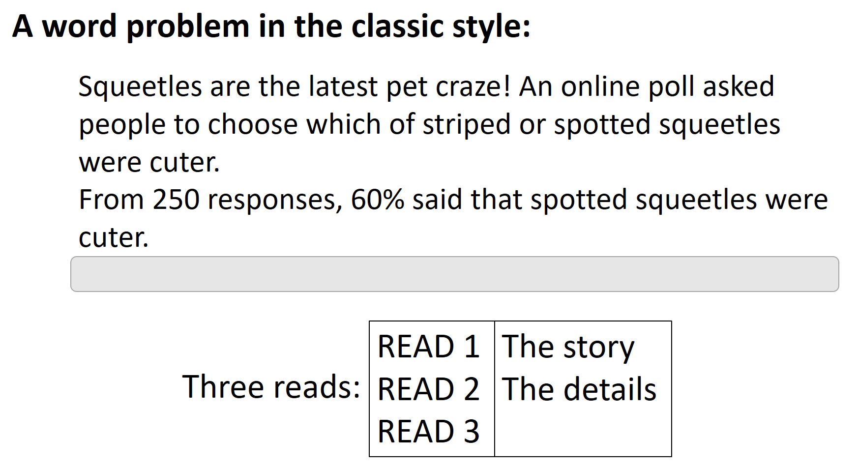
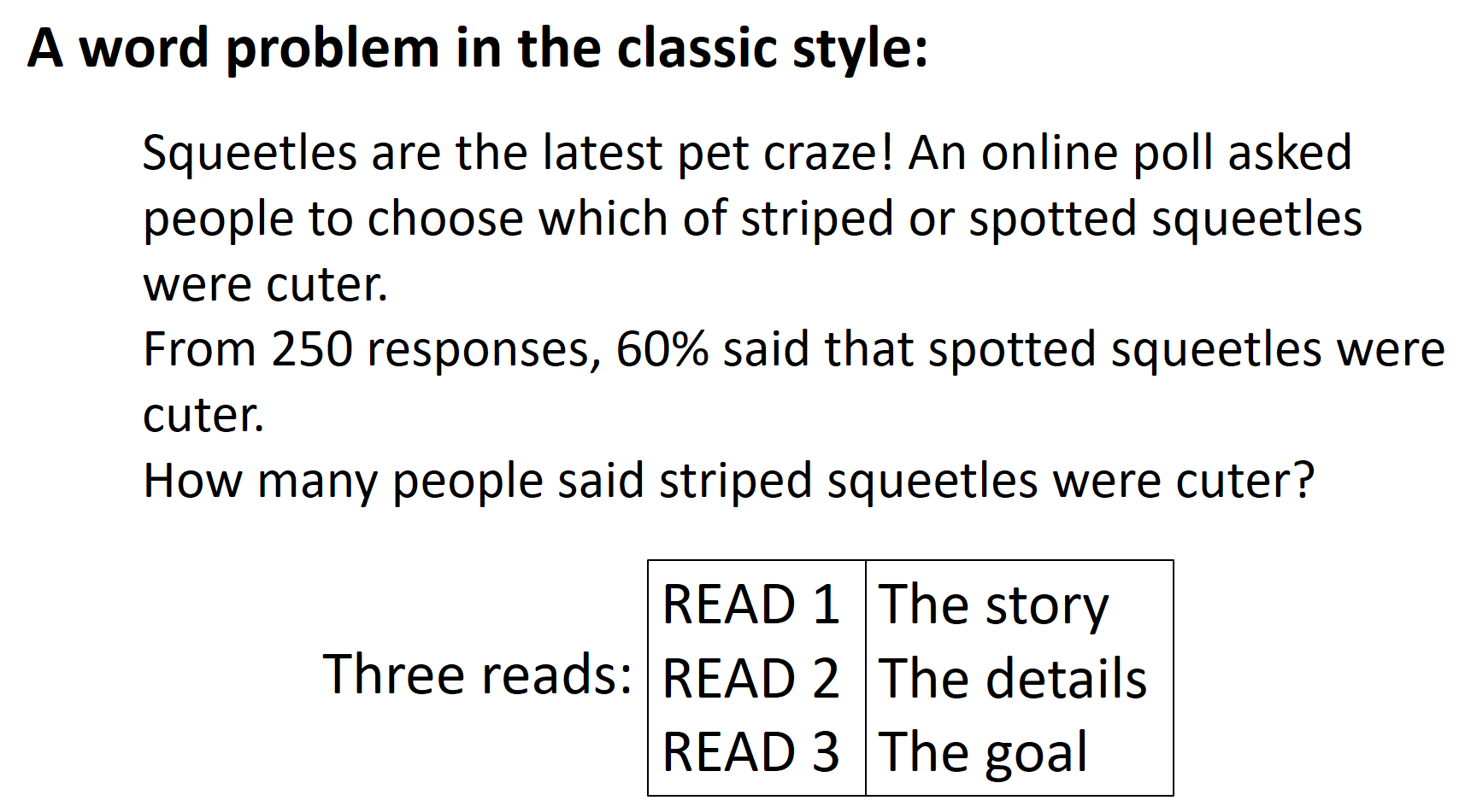
4. The Three Reads
At this point I summarised what we had seen so far:
- You have to know what a number measures/counts for it to be meaningful.
- Numbers are only meaningful by comparison.
- Averages help to compare numbers between groups, but don’t necessarily represent individuals.
- Percentages help to compare groups in terms of more or less in a category.
That is: THE STORY IS WHAT MAKES THE NUMBERS MEANINGFUL
And then I had one activity left to do.
When designing the tutorial, I really wanted to do something that drew all of this together, and gave students a strategy they could use when they came to face numerical information during the course of their degrees. There is a lot of stuff across the #MTBoS about sensemaking and I hoped to use something I had seen there. My first thought was the “How old is the shepherd” problem, as described by Tracy Zager in her book (I wrote a review of this book here) and described in a video by Robert Kaplinsky here. In the end I decided not to use it because I didn’t want to make any of my maths-anxious students feel stupid, or begin a conversation about making sense by presenting something that doesn’t make sense. I was also inspired by the numberless word problems championed by Brian Bushart, which are designed for making sense of context before numbers, but his routine involves rewriting problems from scratch so that the numberless version is the only thing the kids see, whereas I wanted to teach my students to be able to make sense of situations where they had an existing piece of writing and no choice but for there to be numbers in it. And then I heard about a routine called “The Three Reads”, which seemed to be the right thing if I gave it a bit of a tweak. Only later did I hear that there are multiple versions of the Three Reads, with differing usefulness beyond school word problems. Below you will see my version.
So I was finally in the tutorial, and after the squeetles, I told them I wanted to show them a strategy for making sense of writing that has numerical information, and one type of writing with numerical information that they have all seen is the classic word problem from a maths class at school! I revealed the problem for only a few seconds, and then we worked through it according to the Three Reads routine.
Read 1 is about the story. In this part of the routine, we are looking to understand what’s happening. I revealed the first sentence, and asked them what their thoughts were about it. (In later tutes, I said that I knew the story was pretty stupid, so they couldn’t mention that!)
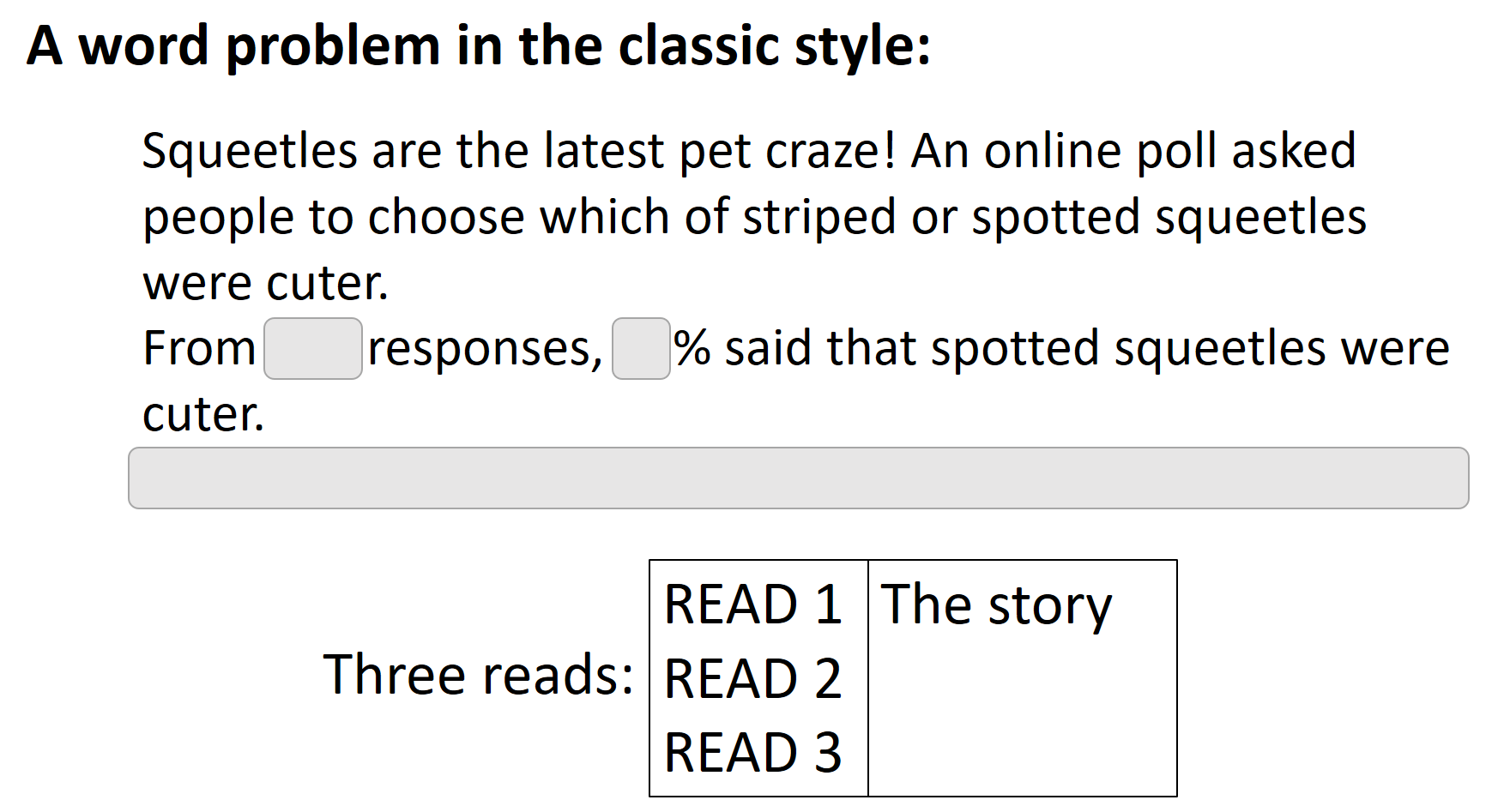
In most classes, the students mentioned that an online poll is not necessarily representative, which led me to ask what group of people you would hope they are representative of, which meant that we needed to think about who would like to know this information. Students mostly thought squeetle breeders or pet shop owners would like to know this information. Another option was just a person who wanted to buy a squeetle and didn’t want to be shamed by friends or strangers for buying the wrong type. I also asked them what other information they might like to know, and apart from wanting to know more about who and why the poll is being run, they also wanted to know what the results were.
After this discussion, I revealed the second sentence with the numbers covered. I asked them to think along the lines of our earlier activities and think about what would be a big, middle or small number for the number of respondents or the percentage. There were various responses for at what point they would think it was enough people to be representative, but this was tempered by the knowledge that squeetles are apparently a “craze”, so you’d want there to be a lot of people. For the percentage, people mostly said not until 80% would it make them commit to a specific type of squeetle as a breeder/seller. For squeetle-shaming, they thought a higher percentage would be ok, because then there would still be some people who would agree with them. I loved this discussion. It was so powerful to see them think about how they would interpret the numbers before they actually arrived.
One shocking moment in the earlier tutes was when one student said it didn’t matter who thought they were cuter because they were all ugly. The rest of the 40 or so students collectively gasped at this shocking statement. I’m glad my little creatures had endeared themselves to the students so much. It did also bring up an important point that the survey won’t tell us whether people think the squeetles are necessarily cute per se, just which people think are cuter.
Read 2 is about the details, in this case, the numbers themselves.
Now that we had the numbers, we could easily decide what to do with them, because we had already thought about it. It was awesome to have people so easily say that maybe it wasn’t the craze the writer said it was, and also that 60% wasn’t nearly far enough from half to make you commit to anything. I pointed this out here, that you were ready to make your own conclusion about the numbers here and weren’t swayed by whatever the writer might have been wanting you to think. Humans are easily swayed by numbers and we’ve shortcutted that by waiting to look at the numbers until we thought about the context first.
Before we moved on to Read 3, I asked the students to discuss what we could figure out from this information. I took multiple responses and multiple ways of figuring them out. People variously came up with 40% said striped squeetles were cuter, 150 people said spotted squeetles were cuter, and 100 people said striped squeetles were cuter. The 150 people was done in multiple different ways in each tute, and I celebrated all of them, saying that we love all student thinking in the Maths Learning Centre and that the key is the reasoning. In most tutorials, at least one student piped up and said we don’t actually know whether there was a “neither is cuter” option, so we can’t be sure it was actually a whole 100 people who said that striped squeetles were cuter. I loved that, and pretended it was a new idea in most of the tutes that people brought it up.
Read 3 is about the goal. I revealed the final sentence, and lo and behold we had already calculated it. In fact, we even had a better answer than the original question-writer had in mind, which is that there are up to 100 people who thought striped squeetles are cuter, depending on what the other options in the poll were. I noted how easy it was for us to just do this, since we had already thought deeply about what was going on before we even read the goal. I also commented that without the earlier focus on the story and the details, the goal wouldn’t have made any sense. If we had started with the goal we would have been playing catch-up the whole time, going back and forth to fill in things we needed for it to make sense and probably getting confused in the process.
At this point I made a big deal of how you can apply this strategy to anything that has numbers in it. When you read a government report or a newspaper article, you can make sure you understand the context, and you can look up the general sizes of the numbers involved before you read what they say about them, so that you can have your own opinion and decide your own conclusions before you read the writer’s conclusions. Then you are able to evaluate whether you agree with their conclusion or not.
I also said that the Three Reads is a useful strategy for reading anything, even if there are no numbers involved. For example, a History essay question. If your History essay asks you to discuss a particular figure in History, then you can think about the general story of the historical period and what’s going on, and then think about the details of the particular person and think about what things you could say about them, and then you can read the actual goal of the essay. By the time you’ve done all that thinking, the goal will make sense and you will probably already have an outline for your essay. Many students really liked that particular idea.
And this brought us to the end of the tute. I emphasised again that it was their Arts skills of understanding context and story that help them to make sense of number, and if they want to fill in any of the details about specific things, then they could always come and talk to the Maths Learning Centre. And I walked away, usually into the next tutorial where I would do it all again with a new set of students.
Reflection
It was a rollercoaster of a week. The regular tutors ranged in attitude from Tigger-like enthusiasm to open hostility at my presence, and ranged in participation from joining in with the activities and helping to draw connections to the rest of the coursework to actually leaving the room to avoid participating entirely. The students generally got into it, with various degrees of apathy, but generally I got the feeling they weren’t sure what to do with these weird activities so different to the usual methods of just chatting. One student emailed the executive dean of the faculty to complain about me doing patronising “primary school activities” with them (but I later learned this was not unique to my week of class). Still to be fair to that student, I think many students in this course would have liked it to be more boring in the sense of feeling like they got work done.
The original plan was to have the second half of the tutorial be about applying the ideas they had seen to their actual course materials, but due to me not being ready until the weekend before, and also the course being basically written as it was being taught anyway, this didn’t work out. My experience tells me we really need to make sure this happens in future semesters. In the future, I think I will likely create a whole new set of activities about making meaning of a real article or even just a graph (like I do with the Health Science students), though I reckon I can still focus on the Three Reads because they did find that useful for their Arts stuff too.
When all is said and done, I am still proud of the activities I made, and I hope to use them again, but maybe with a different cohort, or at a different time, or with a bit of tweaking.
Resources
To finish off, I thought I would collect together the resources if you want a closer look at them.
- Powerpoint I used in the class
- Squeetles resources:
- Video recording of one of the tutorials from the week, if you’d like to see how I went about leading the activities and discussion live.
- The tweets I made while planning these activities in two sprawling threads here and here.
- The tweets I made reflecting on my daily experience while doing the tutorials.
Thanks for reading.
Brilliant David! So much good discussion! (Sorry for the booger students). I love part 2, and am totall inspired by the Squeetles discussion. I applaud you for keeping the discussion moving. I will have to reread all the maths in part 3 to get a better picture if what the students were seeing when they lined up on the axes. A HUGE thank you for all the time but into writing about this project. Yours, Amy
Thank YOU for the encouraging words Amy, and the encouragement while I was planning this in the first place. I really appreciate it.